
http://www.underconsideration.com/brand ... e_logo.php
The new logo is all shades of red/pink. I like the old "new" one better.
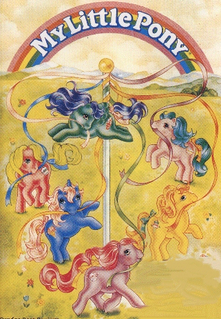
New MLP logo
New MLP logo
Upon the Rainbow, my rainbow blog.

Re: New MLP logo
I like the new one's composition, but as much as I personaly like the colour choices, I know it's very Valentines-ish, and kinda bland.
I still like the original logo better out of all of them, though.
I still like the original logo better out of all of them, though.
"I hope you know what you're doing, Rainbow."
"You still doubt me, after all this time?"
"I don't doubt," Krys said as he paused at the door. "I worry."
-Excerpt from my yet unnamed RB doujinshi.
"You still doubt me, after all this time?"
"I don't doubt," Krys said as he paused at the door. "I worry."
-Excerpt from my yet unnamed RB doujinshi.
-
Starlight_84

- Posts: 70
- Joined: Mon Aug 31, 2009 7:14 pm
- Location: USA
Re: New MLP logo
I don't like the new one. I don't like the new line of ponies either. The style is just wrong and the core 7 thing is getting on my nerves. It's been a while since I bought a G3.

Made By: Tennyo
Re: New MLP logo
I still think the new style is adorable. But, it's kinda japanese anime-ish, so I'm pre-disposed to liking that. I always thought the Applejack mold from the original ponies looked weird, and outside of the cartoon, I wasn't too fond of or attached to the clunky design.
"I hope you know what you're doing, Rainbow."
"You still doubt me, after all this time?"
"I don't doubt," Krys said as he paused at the door. "I worry."
-Excerpt from my yet unnamed RB doujinshi.
"You still doubt me, after all this time?"
"I don't doubt," Krys said as he paused at the door. "I worry."
-Excerpt from my yet unnamed RB doujinshi.

Re: New MLP logo
Ah yes, because little girls can't possibly like any flipping color other then pink. *eye roll* Personally I prefer the old logo much more.
My Deviant Art~ KeonaKii

Re: New MLP logo
I love old skool best of course. I really liked the G3 ones they were quite good in concerning looks to the G1's. But the G4 look lame too me. (But i like the baby ones they have the teeny tiny faces). As for their style, I don't see it as anime-ish at all but rather a take on their pet-shop hybrid they have going on. Some sort of contemporary new style to sell more and to cater to the new style of toys out there.


Re: New MLP logo
I don't like the G4 ponies, they're too deformed. They look like the new Littlest Pet Shop. I had some of the original Littlest Pet Shop animals and they were so much cuter.
Upon the Rainbow, my rainbow blog.

Re: New MLP logo
I happen to like the new MLP logo. It's simply and more stylized. The color gradient of the previous one was kind of a mess, in my opinion.
And the new logo incorporates a tale and a horse shoe! How cute is that?
I agree about the color choices, though. It could be something else, but when it comes to logos I feel that simple is best.
And the new logo incorporates a tale and a horse shoe! How cute is that?
I agree about the color choices, though. It could be something else, but when it comes to logos I feel that simple is best.