Page 1 of 1
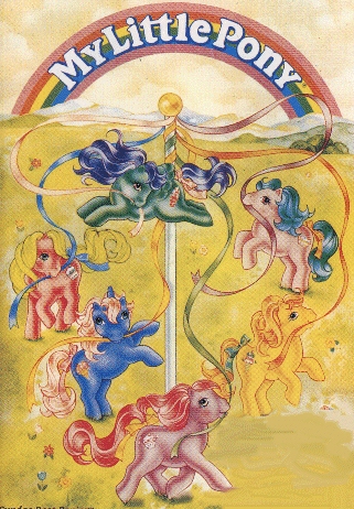
New MLP logo
Posted: Tue Sep 15, 2009 4:00 am
by IndigoJoy
http://www.underconsideration.com/brand ... e_logo.php
The new logo is all shades of red/pink. I like the old "new" one better.
Re: New MLP logo
Posted: Tue Sep 15, 2009 4:44 am
by FanChan
I like the new one's composition, but as much as I personaly like the colour choices, I know it's very Valentines-ish, and kinda bland.
I still like the
original logo better out of all of them, though.
Re: New MLP logo
Posted: Tue Sep 15, 2009 11:47 am
by Starlight_84
I don't like the new one. I don't like the new line of ponies either. The style is just wrong and the core 7 thing is getting on my nerves. It's been a while since I bought a G3.
Re: New MLP logo
Posted: Tue Sep 15, 2009 2:22 pm
by FanChan
I still think the new style is adorable. But, it's kinda japanese anime-ish, so I'm pre-disposed to liking that. I always thought the Applejack mold from the original ponies looked weird, and outside of the cartoon, I wasn't too fond of or attached to the clunky design.
Re: New MLP logo
Posted: Thu Sep 17, 2009 6:00 pm
by Tilas
Ah yes, because little girls can't possibly like any flipping color other then pink. *eye roll* Personally I prefer the old logo much more.
Re: New MLP logo
Posted: Thu Sep 17, 2009 9:01 pm
by *C9*
I love old skool best of course. I really liked the G3 ones they were quite good in concerning looks to the G1's. But the G4 look lame too me. (But i like the baby ones they have the teeny tiny faces). As for their style, I don't see it as anime-ish at all but rather a take on their pet-shop hybrid they have going on. Some sort of contemporary new style to sell more and to cater to the new style of toys out there.
Re: New MLP logo
Posted: Fri Sep 18, 2009 2:28 am
by WishBear2001
G4s are too cute! I really want Pinkie Pie and Rainbow Dash...
Re: New MLP logo
Posted: Fri Sep 18, 2009 11:03 am
by Regina
It looks very commercial, I prefer the old one 100%.
Re: New MLP logo
Posted: Wed Sep 23, 2009 9:42 pm
by IndigoJoy
I don't like the G4 ponies, they're too deformed. They look like the new Littlest Pet Shop. I had some of the original Littlest Pet Shop animals and they were so much cuter.
Re: New MLP logo
Posted: Mon Oct 05, 2009 10:14 pm
by Tennyo
I happen to like the new MLP logo. It's simply and more stylized. The color gradient of the previous one was kind of a mess, in my opinion.
And the new logo incorporates a tale and a horse shoe! How cute is that?

I agree about the color choices, though. It could be something else, but when it comes to logos I feel that simple is best.