My RB Design
- Dialga-Brite
- Posts: 730
- Joined: Sun Aug 31, 2008 9:44 pm
- Location: USA
- Contact:
Re: My RB Design
To me it was a friendly rivalry. 
Number of Pinks in my Tickled Pink Sanctuary: 56
Moonglos: 6
Dress up Rainbow Brites: 9
Moonglos: 6
Dress up Rainbow Brites: 9
- Rainbow Brite
- Admin
- Posts: 1731
- Joined: Tue Sep 02, 2008 5:48 pm
- Contact:
Re: My RB Design
I saw it as Brian trying to impress Rainbow as well - after the way he purposely acted disinterested when she visited him on Earth, then couldn't wait to get to Rainbow Land.
~Katy Cartee Haile~
RainbowBrite.net
RainbowBrite.net
Re: My RB Design
Oh, good. I thought maybe I was wacko T-T
"I hope you know what you're doing, Rainbow."
"You still doubt me, after all this time?"
"I don't doubt," Krys said as he paused at the door. "I worry."
-Excerpt from my yet unnamed RB doujinshi.
"You still doubt me, after all this time?"
"I don't doubt," Krys said as he paused at the door. "I worry."
-Excerpt from my yet unnamed RB doujinshi.
- Major Ursa
- Posts: 359
- Joined: Mon Sep 01, 2008 11:11 am
- Location: Highland Springs, Virginia USA
Re: My RB Design
There was also Star Stealer when she met Krys. It did not exactly start off right.
BTW: Nice work there FanChan.
BTW: Nice work there FanChan.
Rainbow brite fan since 1984.
Re: My RB Design
Thanks a lot ^_^ And yeah, there is some of that feeling there between those two. I've kinda had some fun with that in my story. It's a neat relationship to write with.
"I hope you know what you're doing, Rainbow."
"You still doubt me, after all this time?"
"I don't doubt," Krys said as he paused at the door. "I worry."
-Excerpt from my yet unnamed RB doujinshi.
"You still doubt me, after all this time?"
"I don't doubt," Krys said as he paused at the door. "I worry."
-Excerpt from my yet unnamed RB doujinshi.
Re: My RB Design
Thanks for the idea, but as for my story, I've got things covered ^^; I'm actually nearly finished with the writing aspect of it, just trying to work out the final plot points so it all runs smoothly.
I also managed to get a computer-coloured copy of her done, so now I've got a pallet for her that should make colouring, at least, quick and easy. She's so pretty! Hehe.
I also managed to get a computer-coloured copy of her done, so now I've got a pallet for her that should make colouring, at least, quick and easy. She's so pretty! Hehe.
"I hope you know what you're doing, Rainbow."
"You still doubt me, after all this time?"
"I don't doubt," Krys said as he paused at the door. "I worry."
-Excerpt from my yet unnamed RB doujinshi.
"You still doubt me, after all this time?"
"I don't doubt," Krys said as he paused at the door. "I worry."
-Excerpt from my yet unnamed RB doujinshi.
Re: My RB Design
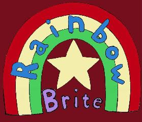
Well, I'm trying to come up with a good logo design for my comic. I wanted something different, while still harkening back to the original logo. Here's the first prototype. I'm interested to know what people think. The background colour would probably change with each 'volume'.


"I hope you know what you're doing, Rainbow."
"You still doubt me, after all this time?"
"I don't doubt," Krys said as he paused at the door. "I worry."
-Excerpt from my yet unnamed RB doujinshi.
"You still doubt me, after all this time?"
"I don't doubt," Krys said as he paused at the door. "I worry."
-Excerpt from my yet unnamed RB doujinshi.
- Chibi Rachy
- Posts: 2533
- Joined: Thu Jan 22, 2009 1:51 am
- Location: West Virginia
- Contact:
Re: My RB Design
Going off first glance, I'd say the rainbow appears too scrunched together...I like the rest of it, but the rainbow just seems really tightFanChan wrote:Well, I'm trying to come up with a good logo design for my comic. I wanted something different, while still harkening back to the original logo. Here's the first prototype. I'm interested to know what people think. The background colour would probably change with each 'volume'.
"If you're obsessed with your yesterday then you're destined to repeat it." - Ariel of Icon for Hire
Re: My RB Design
I think I know what you mean. I actually did some last-minute editing once I had it on the computer, since I came up with an idea after I'd already inked the physical copy. How does the rainbow look in the original?Chibi Rachy wrote:Going off first glance, I'd say the rainbow appears too scrunched together...I like the rest of it, but the rainbow just seems really tight
"I hope you know what you're doing, Rainbow."
"You still doubt me, after all this time?"
"I don't doubt," Krys said as he paused at the door. "I worry."
-Excerpt from my yet unnamed RB doujinshi.
"You still doubt me, after all this time?"
"I don't doubt," Krys said as he paused at the door. "I worry."
-Excerpt from my yet unnamed RB doujinshi.
- Chibi Rachy
- Posts: 2533
- Joined: Thu Jan 22, 2009 1:51 am
- Location: West Virginia
- Contact:
Re: My RB Design
Much better in the original, definitely! I also like Brite better in the star than outside of it, but that's just me.FanChan wrote:I think I know what you mean. I actually did some last-minute editing once I had it on the computer, since I came up with an idea after I'd already inked the physical copy. How does the rainbow look in the original?Chibi Rachy wrote:Going off first glance, I'd say the rainbow appears too scrunched together...I like the rest of it, but the rainbow just seems really tight
When I was looking at the first one, I was trying to think if I'd pick it up (brand name aside) based on the logo. Some webcomic artist does this with her new covers for the books and has her viewers decide if just by glancing at it would they pick it up.
"If you're obsessed with your yesterday then you're destined to repeat it." - Ariel of Icon for Hire